

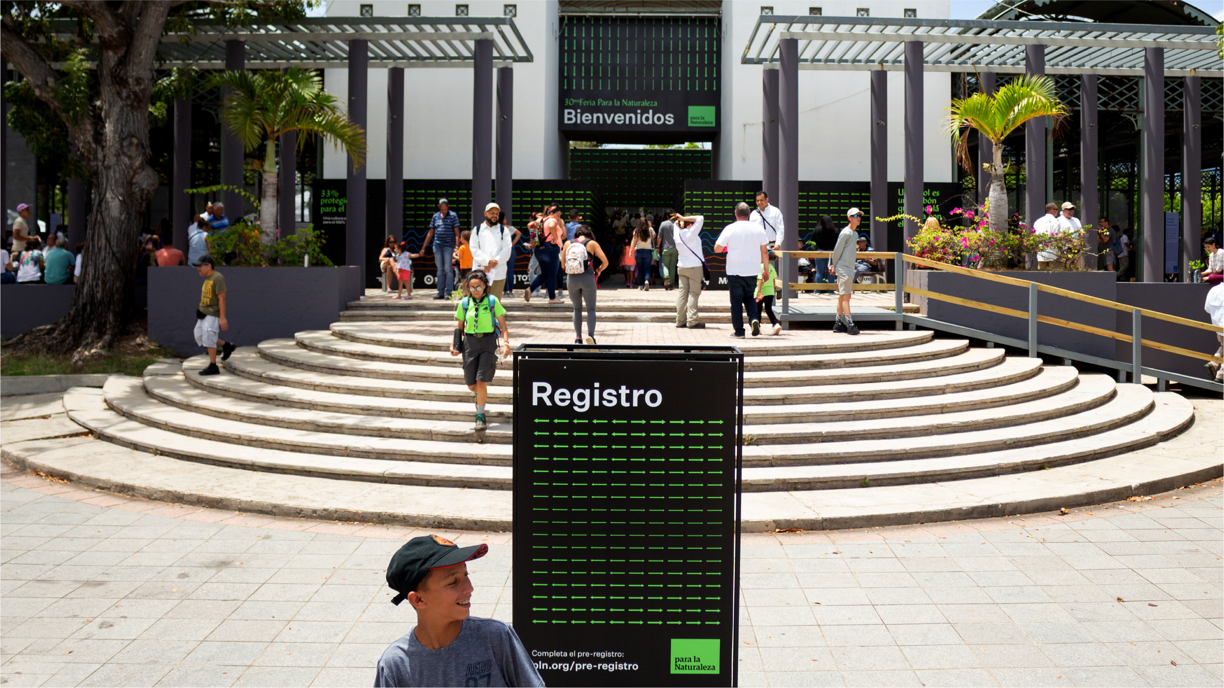
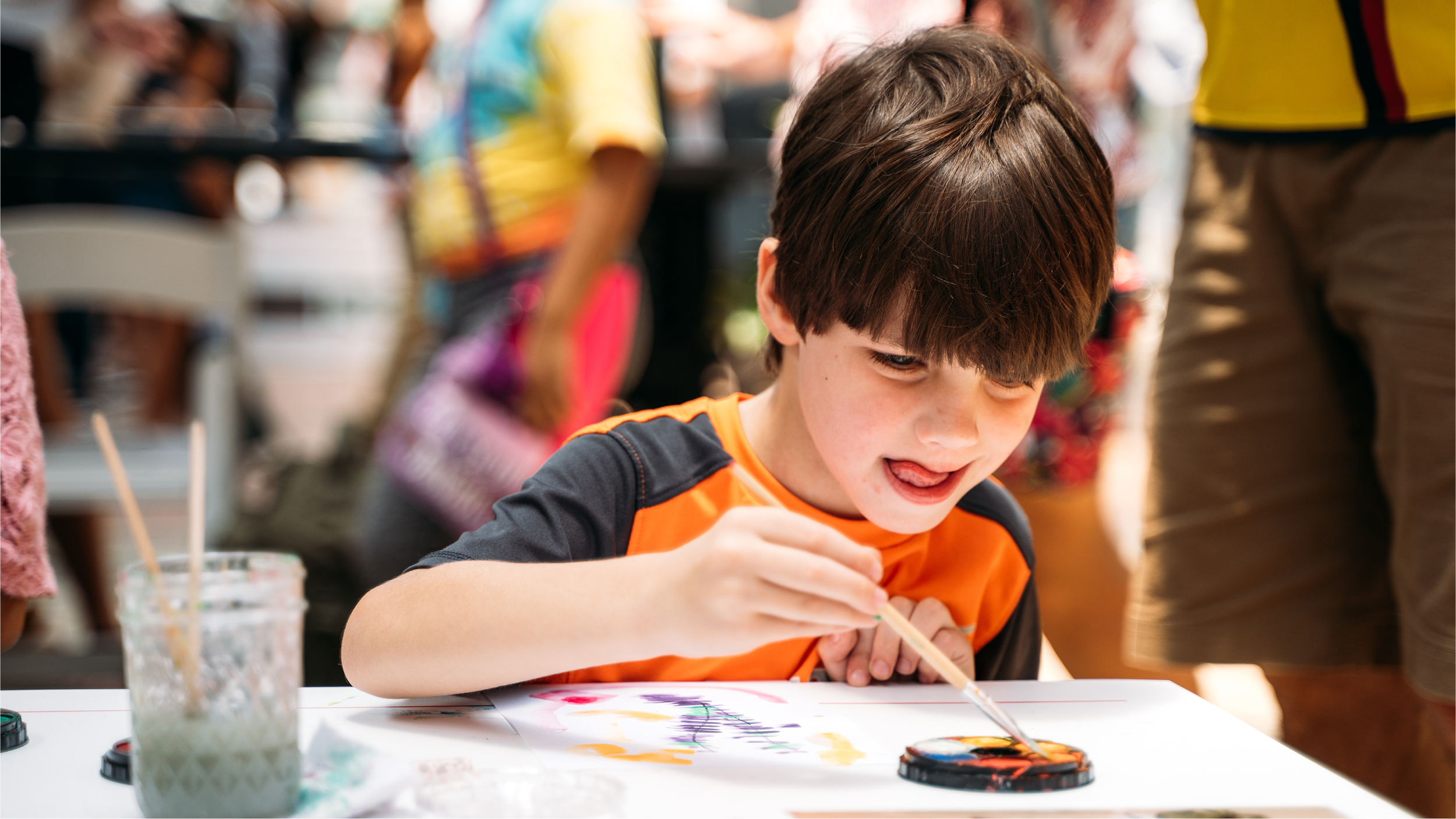
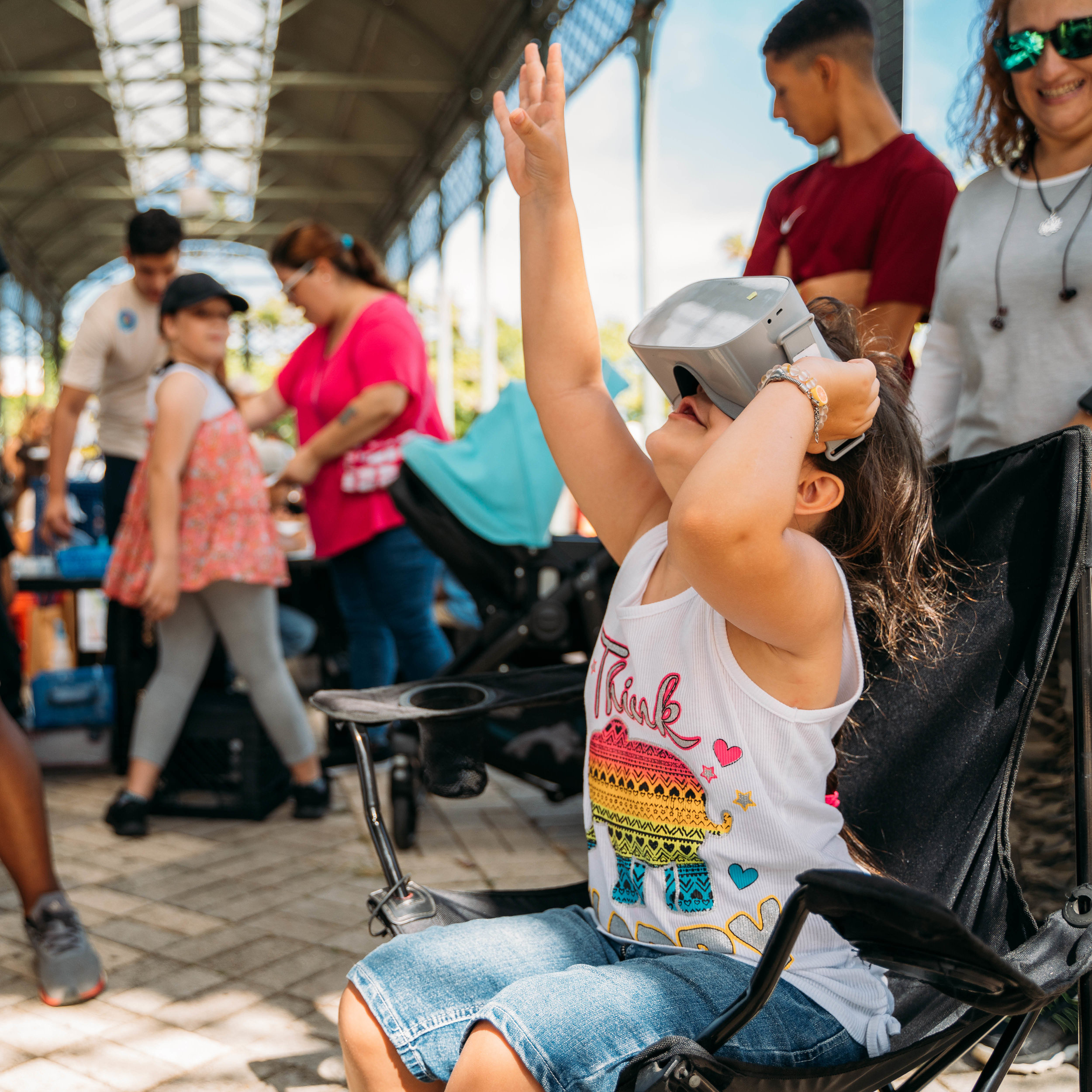
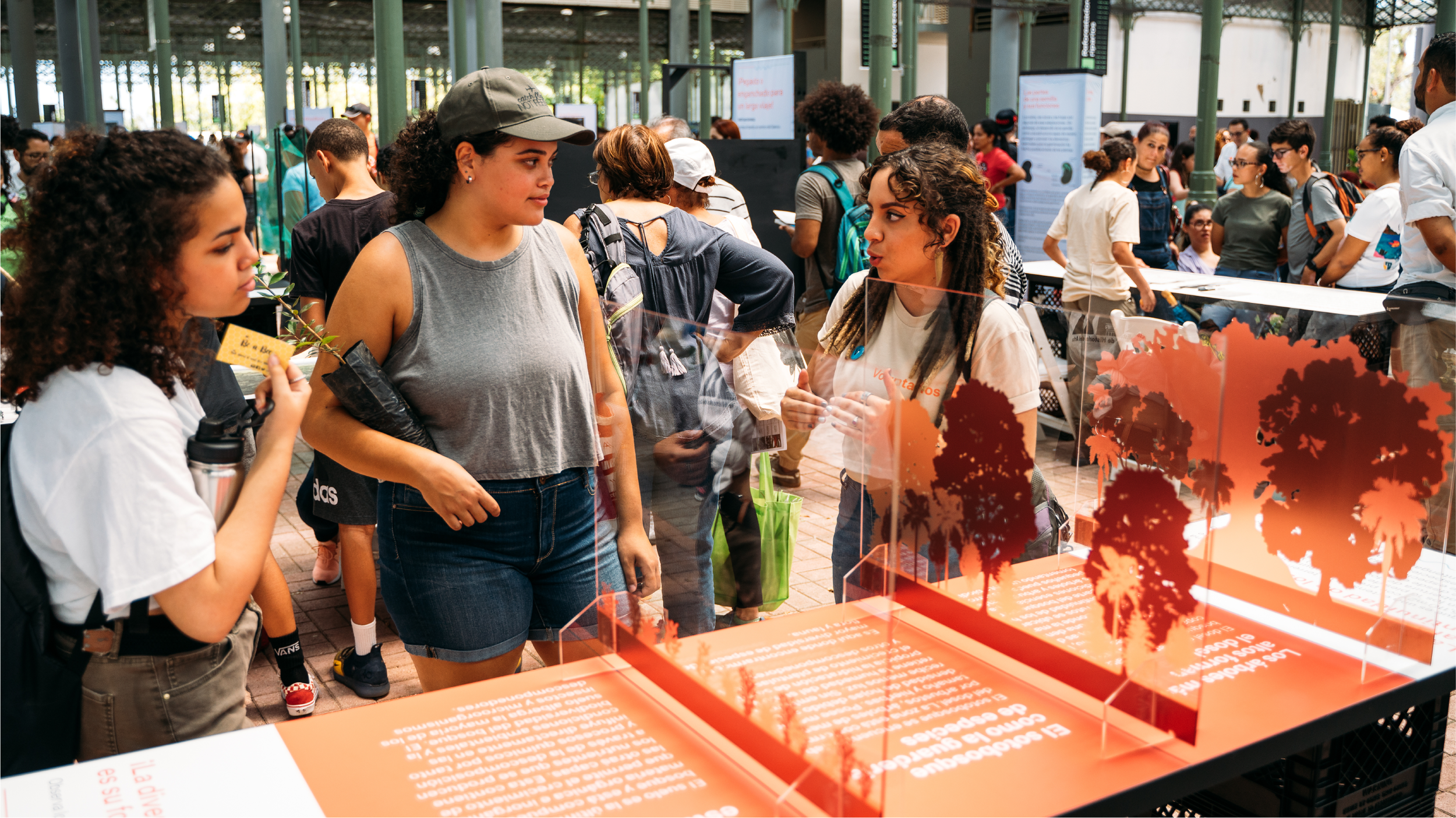
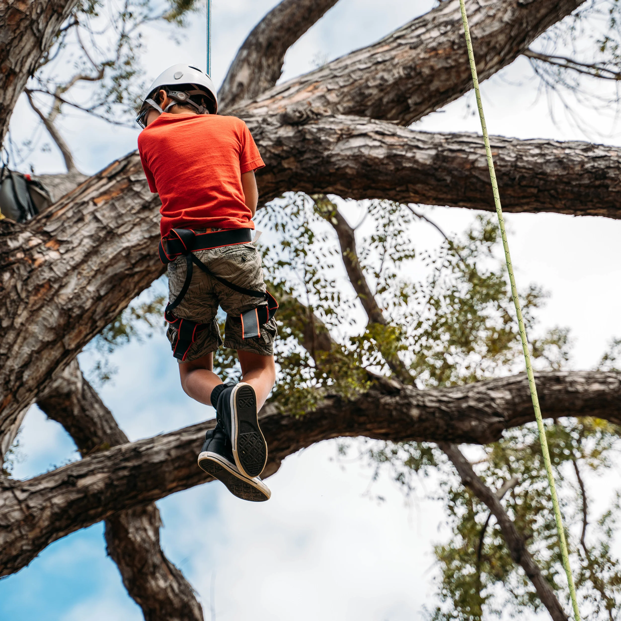
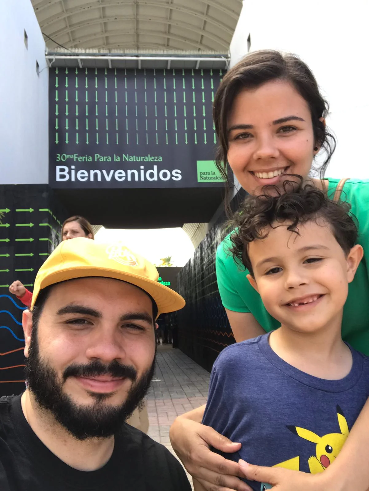
The Para la Naturaleza Fair is an annual event organized by Para la Naturaleza, a non-profit organization that integrates society into the conservation of its natural ecosystems through education and immersion activities. This free public event -comprised of exhibitions, educational and informative modules,

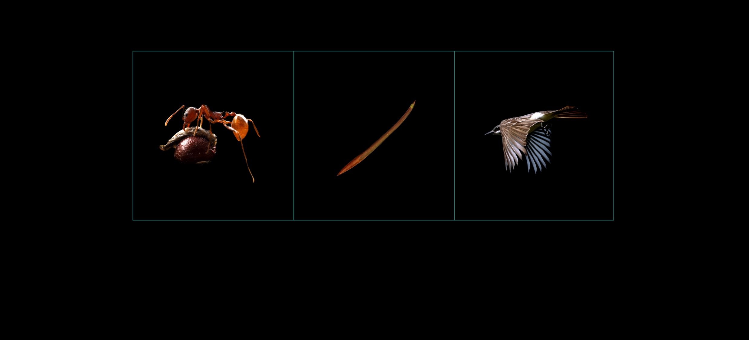
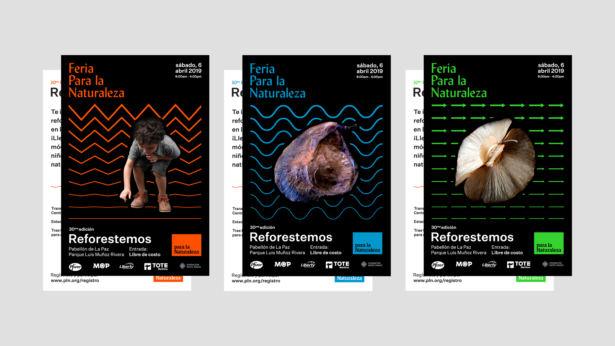
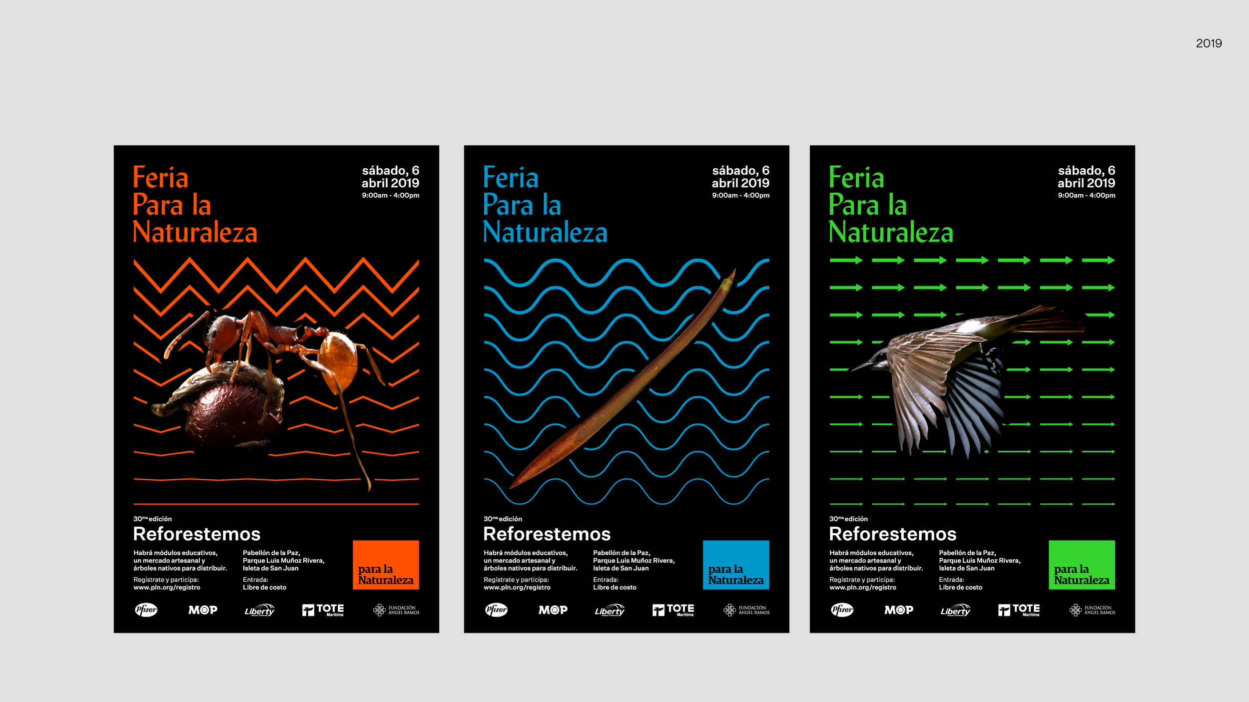
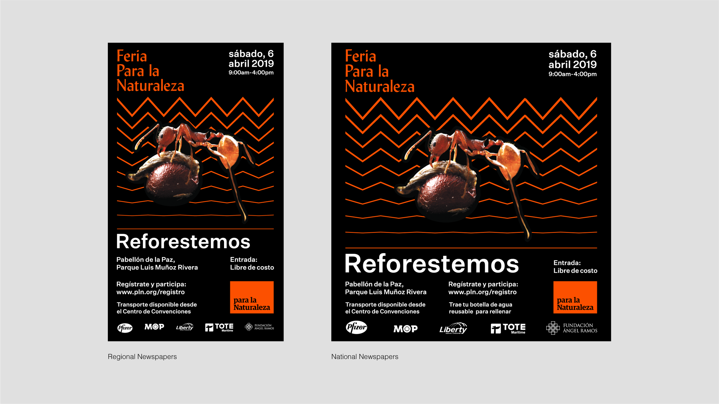
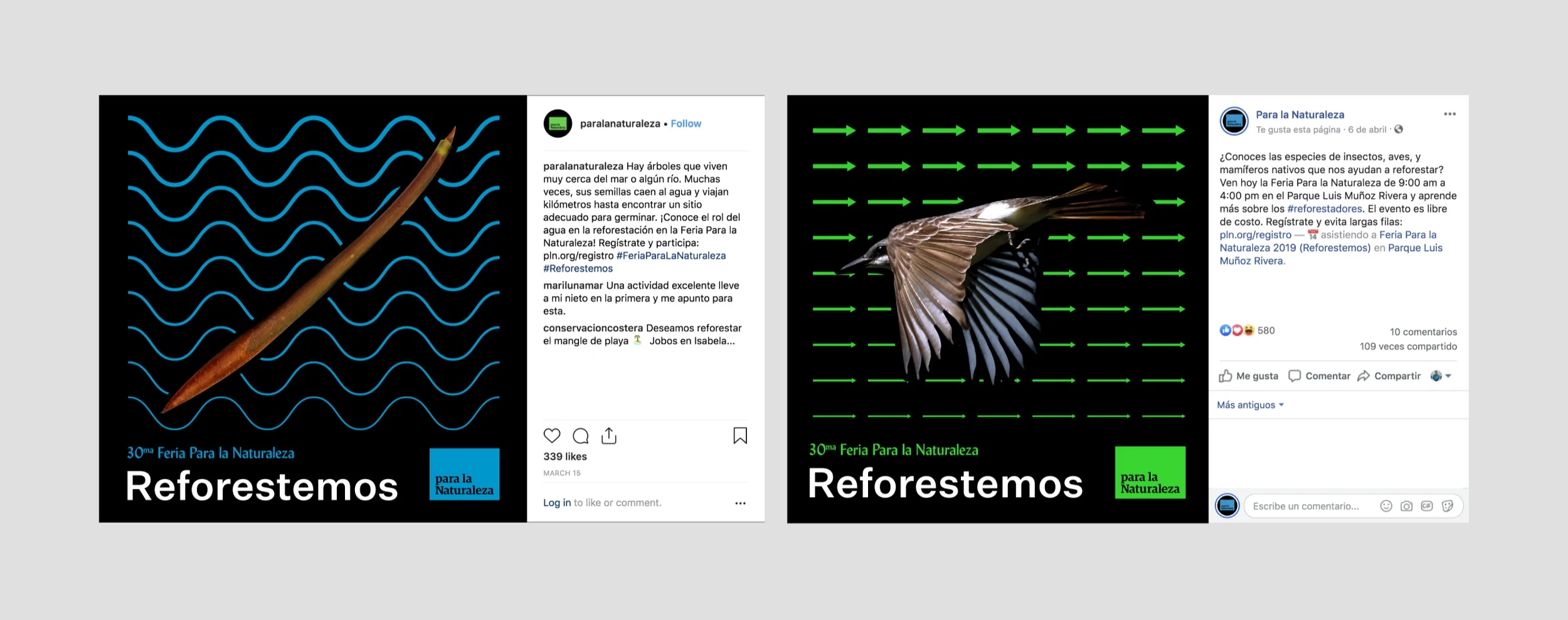
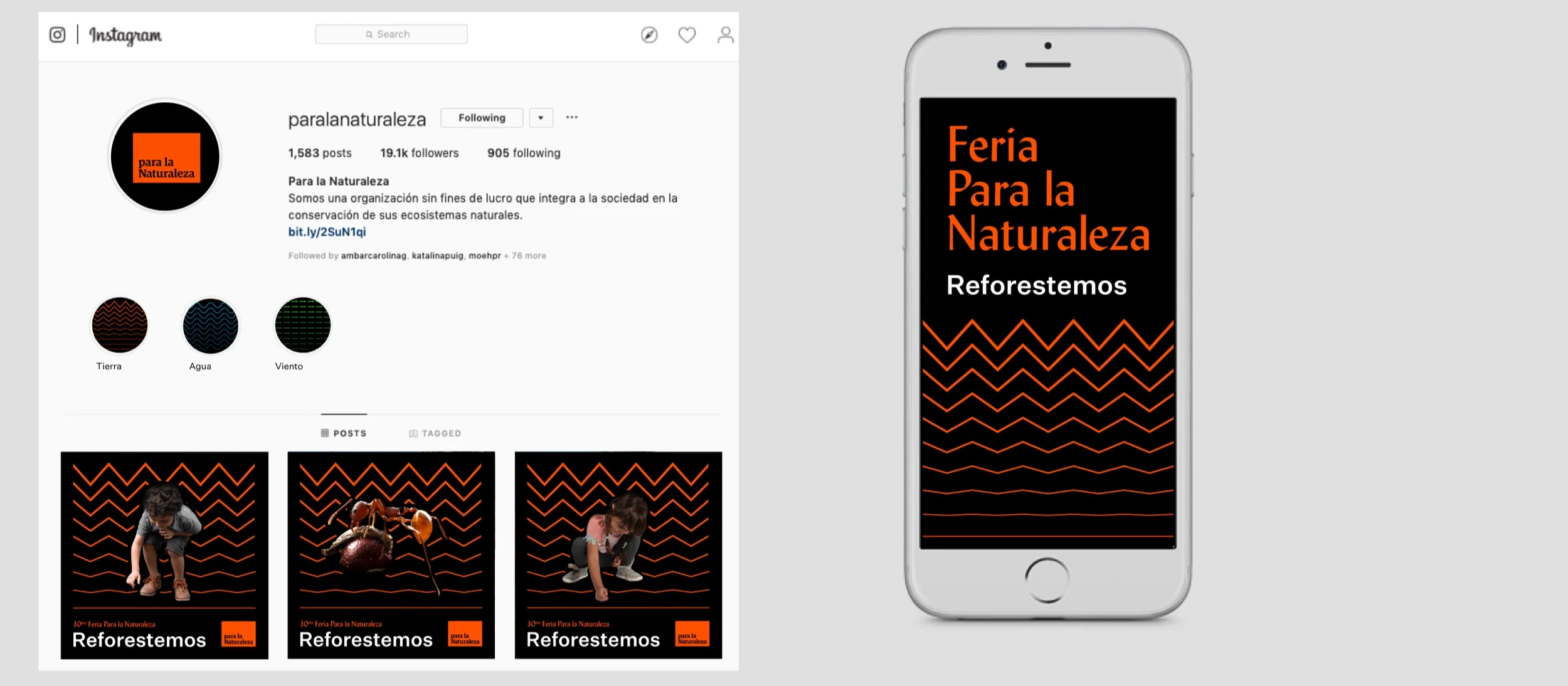
The visual concept developed seeks to represent a sophisticated theme in a simple way using two levels of information: 1) patterns (images in vectors) that would represent abiotic elements such as wind, water and earth 2) realistic photographs that would represent biotic elements such as seeds, birds, bats, ants, and humans.
The pieces invite to reflect on day-to-day human disconnections with nature; the hustle, the apogee, and the daily tumult. It also invites to learn more about how reforestation processes are carried out through scientific data.

The patterns
The development of the patterns concurred with what Munari (1966) had classified as "Poster without end" and "Poster with a central image."
The patterns, basis of the visual concept, were designed taking into consideration the following foundations: modularity, repetition, sequence, and color gradation. At the same time, patterns maintain a solid base where images interact. This combination of patterns and images helped create a clean and harmonious visual language, as well as the desirable plasticity and continuity.
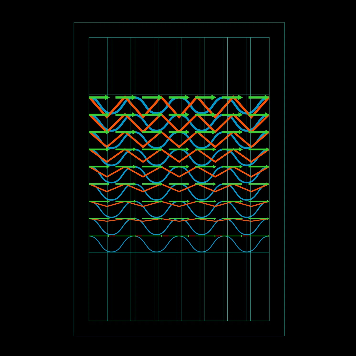

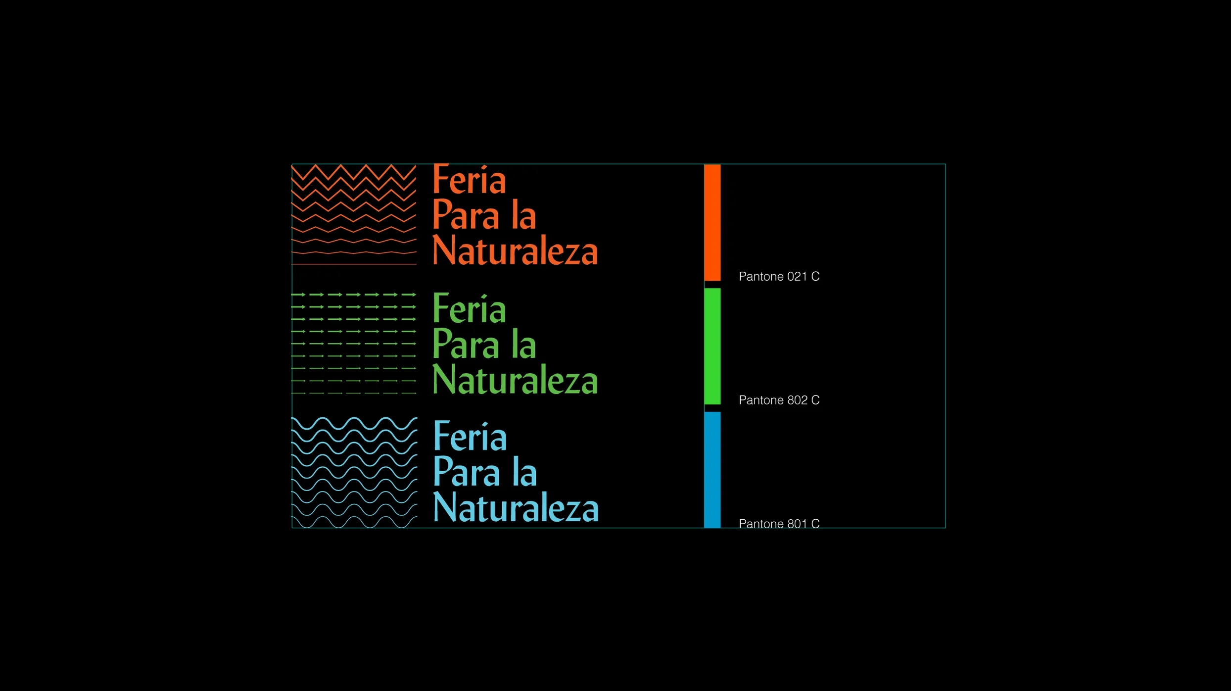
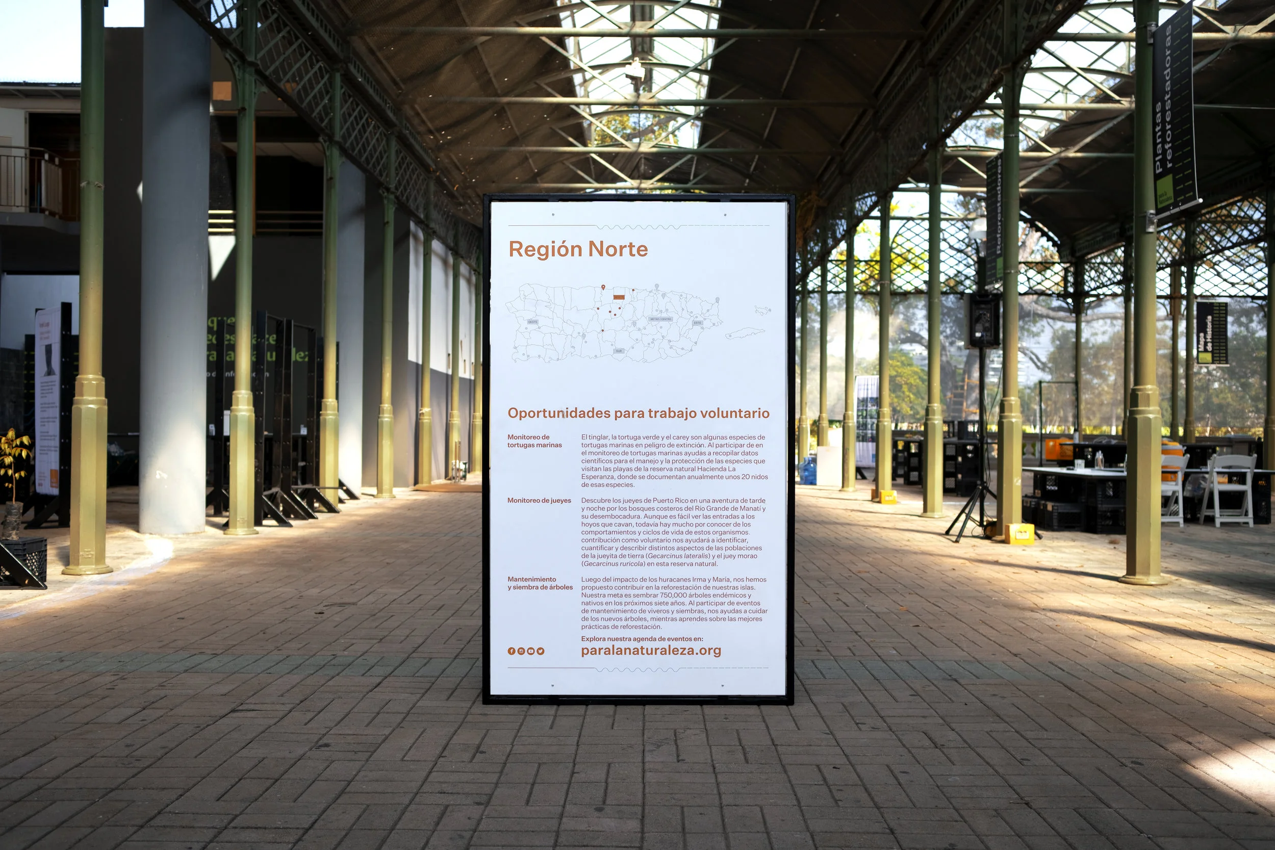
The color palette uses bright shades of colors in contrast to the black background to highlight the different movements of the elements of nature; the images, the graphics, and the text.
Meanwhile, the typographic selection combines the use of Monotype Lydian, which has a marked calligraphic structure for titles, and of Untitled Sans by Klim Type Foundry in the informative texts.
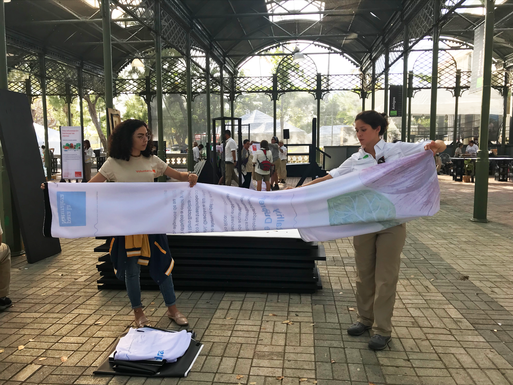
The design of the exhibition supports the educational mission of the organization and the different levels of public learning. The pieces helped create spaces in which people could move around and participate in interactive activities.
Regarding the materials, we take the following considerations: their resistance to rainwater and strong wind, facility to transport, install, uninstall and store, as well as their capacity to be reused or recycled. Finally, we decided to use fabrics (installed in custom-made structures), cardboard, digital screens, among others.
Posters

Newspaper
TV & MOTION GRAPHICS
Multimedia Graphics by Nunolein, Josue Oquendo
Social Media
Content

Some of the campaign content
Exhibition

Pabellón de la Paz
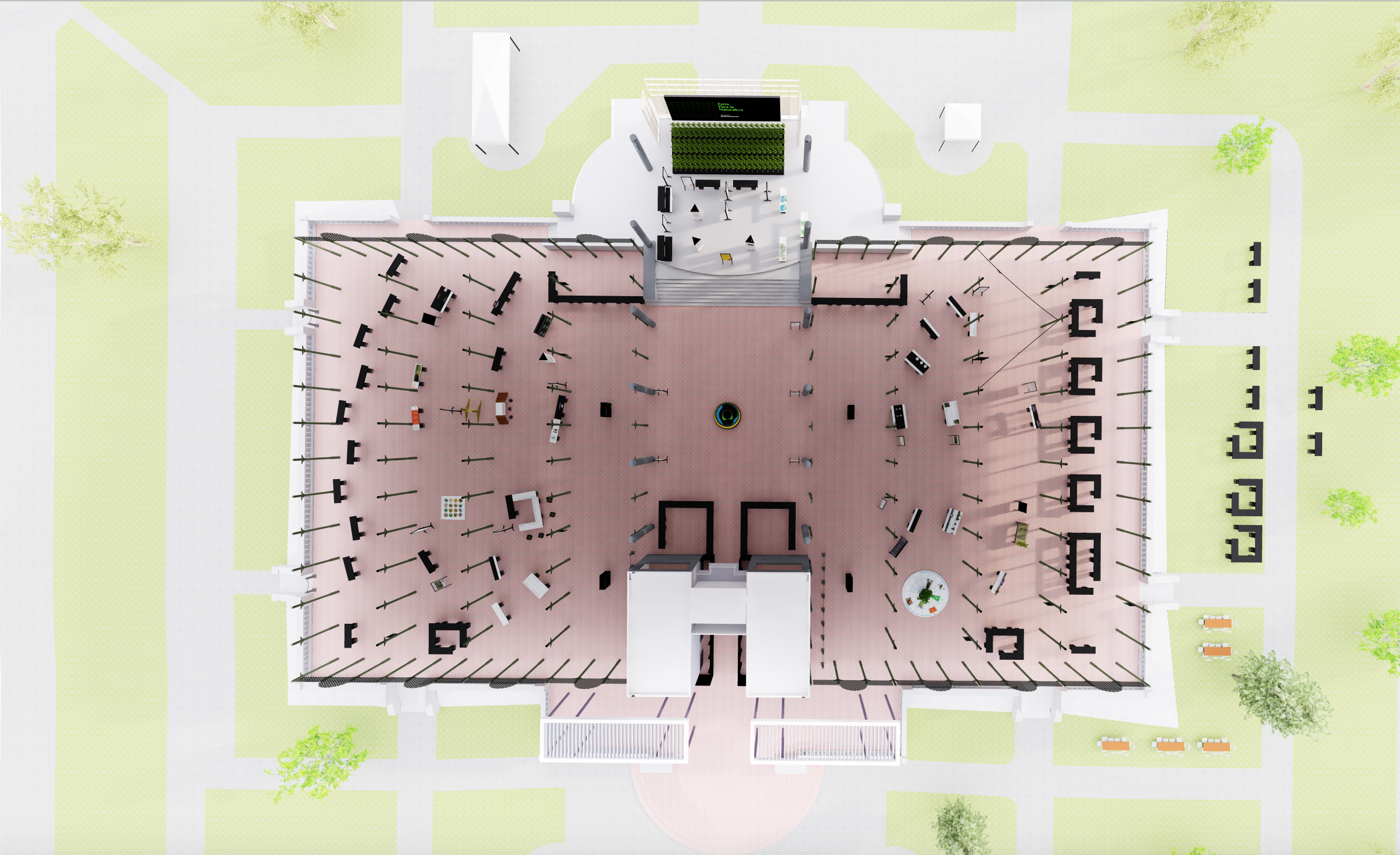
Design based on circle shapes from the ecological calendar

Exhibition Goal
Working with recycled materials, promote the second use of materials and create modular structure that makes agile exhibit installations.


The Event


Design Project Scope
Visual Brand Strategy
Brand Design
Visual Design
Campaing Items
Campaing System
Social Media
Print & Digital Material
Exhibition Design
Creative direction
Anayra Santori
Ramdwin González
Vanessa Colón
Design Team
Gerardo Veléz
Josue Oquendo
Deborah
Karla
Kaleb
Anexis Morales